
EasyBlog Panel Block

The missing nestable composer-block

The Block

The new card/panel block is located in the Elements group and can be easily placed in the layout like any other block.

The Styles

There are 8 basic styles available. The colors (including text color), the inner padding of the panels, and the corners can be customized individually. Successful panels can be easily saved as templates in the Composer and reused.

The colors

The background color of the panel can be freely selected. If it is set in the “Individual color” section, the color of the basic style is overwritten and the individual color is applied. There is a reset button to the right of the color picker. If the individual color selection is reset (by clicking on the reset button), the panel reappears in the color of the selected style. The same applies to the text color setting.

The corner style

The corners can be rounded. The basic configuration provides for 0px, 3px, 5px, 8px, 12px, and 20px, but individual values are also possible (between 0px and 100px). If a value is set under “Individual setting”, the value selected under “Border radius” will be overwritten.

The Padding

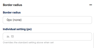
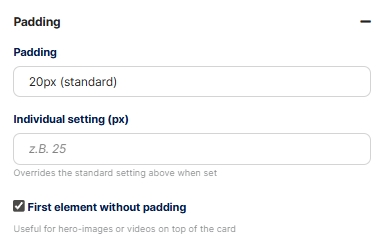
The inner spacing (padding) has the default settings 0px, 10px, 15px, 20px, 30px, and 40px. As with the corner style, individual values are possible. If the individual value is set, the value selected under “Padding” is overwritten.

To place “Hero” photos or videos at the very top of the panel without padding, there is a setting called “First element without padding”. If this checkbox is activated, the padding is removed from the first element in the panel.

The basic functions

Like any Composer block, the Panel block can be moved, saved as a block template, duplicated, or deleted. Since the Panel block is a nestable block, an unlimited number of additional elements (blocks) can be integrated. This is done by clicking on the plus button in the block or by placing any element within the Panel block.

Site-Template

The frontend display is generally based on the selected site template. By using the same font, basic colors, margin settings, etc., the panel appears as an integrated element rather than a separate one.

The element structure tree

In Composer, all elements integrated in the panel can be viewed and selected in the structure tree: All specific element settings can be made as usual.

Placement in the post, width

Tip: The width of the panel can be easily adjusted using the “Columns” layout block. To do this, simply drag the panel into a column with the width of your choice.

Frontend display

This is what a finished panel could look like in the front end. The big advantage is that, even in terms of the output code, it is a single unit that can contain multiple sub-elements. There are virtually no limits to your imagination.

Corner style and hero image

The rounded corners are applied correctly to the first element without padding, so that no overlaps occur.

Further nesting

Layout elements within the panel are also possible, such as a column element, which divides the interior of the panel according to your preferences. This makes it easy to place additional nested elements next to each other.

Complete structure tree

Even with more complex nested elements, the structure remains clear and hierarchical, the individual blocks can be selected and freely customized.

We use cookies
We use cookies on our website. Some of them are essential for the operation of the site, while others help us to improve this site and the user experience. You can decide whether you want to allow cookies or not. Please note that if you reject them, you may not be able to use all the functionalities of the site.